Air quality trends: Striking global images expose the 'invisible killer'
Air pollution, often referred to as the “invisible killer,” varies drastically across the globe. Poor air quality impacts both developed and developing nations alike, from bustling metropolitan cities to rural landscapes.
The adverse effects of air pollution contribute to millions of premature deaths annually and pose severe risks to respiratory and cardiovascular health.
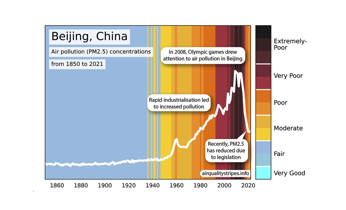
A new initiative by a group of acclaimed scientists has brought this pressing issue into sharp focus with the creation of “Air Quality Stripes.”
These striking visuals provide a vivid representation of global concentrations of particulate matter, a major air pollutant known to affect human health.
The project, a collaborative effort involving the University of Leeds, the University of Edinburgh, North Carolina State University, and the UK Met Office, highlights both the significant improvements in air quality across Europe and the alarming decline in parts of Africa and Central Asia.
The not-so-invisible killer
Dr. Kirsty Pringle from the University of Edinburgh was the co-director of this project: “Air pollution is often called the ‘invisible killer,’ but these images make the invisible visible, showing the changes in particulate matter pollution over the decades.”
Dr. Jim McQuaid, another key researcher from the University of Leeds, emphasized the severity of air pollution.
“The bottom line is that air pollution is one of the world’s leading risk factors for death, it is thought to contribute to one in ten deaths globally,” said Dr. McQuaid.
“The stripes demonstrate that there is still more work to be done to reduce people’s exposure to poor air quality, and in some places a great deal more!”
The air quality canvas of the world
The Air Quality Stripes followed the modus operandi of the globally recognized climate stripes graphics.
Scientists chose to illuminate the shifting trends in outdoor concentrations of particulate matter air pollution — a mixture of microscopic liquid or solid particles found scattered in the atmosphere.

Dr. Steven Turnock, a senior scientist from the UK Met Office, provided the crucial data for the Air Quality Stripes.
“Presenting this scientific data as Air Quality Stripes really brings into focus the stark contrast in air quality trends and people’s exposure to poor air quality depending on where they live.”
The colors of air quality
The Air Quality Stripes feature every nation’s capital city, with additional stripes for China, India, and the United States. The team also included their university cities – Leeds, Edinburgh, and Exeter.
The lightest blue stripes adhere to the World Health Organization Air Quality Guidelines introduced in 2021, with all other colors exceeding the guideline values.
This data project was not just a synthesis of computer simulations and satellite observations; it also involved the flair of an artist tasked with creating the color palette for the stripes.
Key revelations and future hopes
The insightful visuals reveal fascinating trends. Europe has made significant strides in reducing particulate matter levels, with substantial improvements in cities like London, Brussels, and Berlin.
In contrast, the visuals unmask a worrying surge in particulate matter pollution across many cities in central Asia and Africa, such as Islamabad, Delhi, and Nairobi.

“The images show that it is possible to reduce air pollution; the air in many cities in Europe is much cleaner now than it was 100 years ago, and this is improving our health. We really hope similar improvements can be achieved across the globe,” said Dr. Pringle.
The Air Quality Stripes have followed in the illustrious footsteps of the climate warming stripes, reinforcing the dramatic changes in our environment through compelling visuals.
Global awareness and policy implications
The introduction of the Air Quality Stripes is more than just a visual representation; it’s a powerful tool for raising awareness and driving change.
By making air quality data visually accessible and understandable, these images can play a crucial role in informing policymakers, environmental advocates, and the general public about the urgency of addressing air pollution.
With air quality being a significant public health concern, leading to respiratory and cardiovascular diseases, these stripes highlight the disparities in air pollution exposure between different regions and emphasize the need for targeted interventions.
Click here to see Air Quality Trends in Stripe Graphs for hundreds of cities around the world.
—–
Like what you read? Subscribe to our newsletter for engaging articles, exclusive content, and the latest updates.
Check us out on EarthSnap, a free app brought to you by Eric Ralls and Earth.com.
—–


