Maps of the world look much different than reality in people's minds
Almost 100,000 people around the world played an online map projection game that asked them to judge land areas. Their guesses showed that most people’s inner picture of the planet is closer to reality than to a distorted classroom wall map.
The test focused on big comparisons, such as Africa versus Europe or Canada versus India, the kinds of matchups people argue about.

It also probed a long running puzzle in geography, whether common world maps quietly reshape how people think the planet is laid out.
World maps can trick your brain
The work was led by Lieselot Lapon, a cartographer at Ghent University in Belgium. Her research focuses on how people read maps and build mental images of the world.
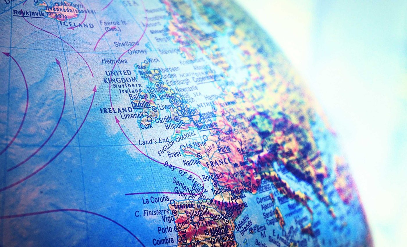
Every flat world map uses a map projection, a method that turns the curved surface of Earth into a rectangle or other shape.
Projections always warp something, whether it is area, distance, direction, or the shape of continents and countries.
The familiar Mercator projection – a map that keeps accurate compass directions – hugely enlarges high latitude regions like Greenland and Canada.
Critics have long worried that this skewed sizing feeds a Eurocentric picture of power, with Europe and North America seeming unusually dominant.
Online platforms often rely on Web Mercator, a projection used for fast web maps that exaggerates land near the poles.
Cartographers have dissected this choice in a detailed analysis, warning that it can mislead people who try to compare areas.
Human minds’ map projection
In the new study, volunteers saw two regions on screen and resized one until it felt proportionally correct. Each person completed ten comparisons, then answered a short survey about education, age, and everyday use of maps.
The test ran in eight languages and used a colorful interface so people would focus on the task instead of the technology.
Those choices were meant to tap into each person’s cognitive map, their internal sense of where places sit and how they compare in size.
After the comparisons, participants selected the world map style they recognized most easily. Choices included common classroom projections such as Mercator, Gall Peters, Mollweide, Robinson, plus a no idea option.
Map interfaces are changing too, and Google Maps shifted its desktop global view from a flat world to a globe.
What the test revealed
Comparing the answers with different map projections, the team saw that estimates matched the globe’s real areas better than any flat map.
“Evidence indicates that knowledge of the world is influenced by map projections,” wrote Lapon.
High latitude regions were not consistently judged larger than regions near the equator, so the classic Mercator effect on area did not show up.
Earlier research with university students had pointed in the same direction, but this dataset is far larger and more diverse.
Looking at continents, Europe tended to be oversized in people’s estimates, while Africa and Asia were usually closer to their true share of land.
For individual countries, small ones were more likely to be enlarged than huge ones, echoing a classic paper on biased size memory.
The team also tested how different projections changed performance by showing some continents and northern countries in Mercator, Gall Peters, and other variants.
Lambert conformal conic, a projection that preserves local shape across latitude bands, still led to slightly larger errors than the more familiar Mercator version.
Why familiarity with better maps matters
The survey question about familiar world maps turned out to be surprisingly informative.
Countries where many participants chose the Robinson projection as their usual map had, on average, smaller errors when judging areas.
That pattern fits work showing that the Robinson projection, a compromise world map, often appears less distorted to readers than many other projections.
In one classroom survey, students with more training in projections relied less on landmass shapes alone when deciding which maps were trustworthy.
National policies, textbook choices, and the default settings of online maps all help decide which projection people grow up seeing most often.
The new results suggest that when those defaults favor more balanced maps, people’s mental images of continental size can quietly become more accurate.
In contrast, groups from countries where people mainly picked Mercator as their usual world map tended to show larger mistakes in the same tasks.
That pattern hints that education about projections, not just swapping one wall map for another, shapes people’s sense of fairness between places.
Lessons from world map projections
An important lesson from this work is that people are not simply copying the world they see in one familiar wall map.
Their cognitive maps reflect many influences, including school, media, travel, and general reasoning about how big a place with billions of people should be.
For teachers and journalists, the choice of projection is still worth care, yet switching to any equal area map is not a magic fix.
Here, people judged continents more accurately in the familiar Mercator view than in the stretched Gall Peters version that preserves relative sizes.
Students need practice reading map details, asking what each projection preserves, what it distorts, and whose story it tells.
If classes treat those questions as normal parts of geography, future generations may carry mental maps that are both more accurate and more critical.
The study is published in ISPRS International Journal of Geo-Information.
—–
Like what you read? Subscribe to our newsletter for engaging articles, exclusive content, and the latest updates.
Check us out on EarthSnap, a free app brought to you by Eric Ralls and Earth.com.
—–


