New map allows you to see what kinds of rocks and sediments are beneath your feet
The U.S. Geological Survey (USGS) just released a powerful tool that allows anyone and everyone to see what lies beneath towns, farms, and cities around the nation. U.S. Geological Survey (USGS) announced the tool on August 28, 2025.
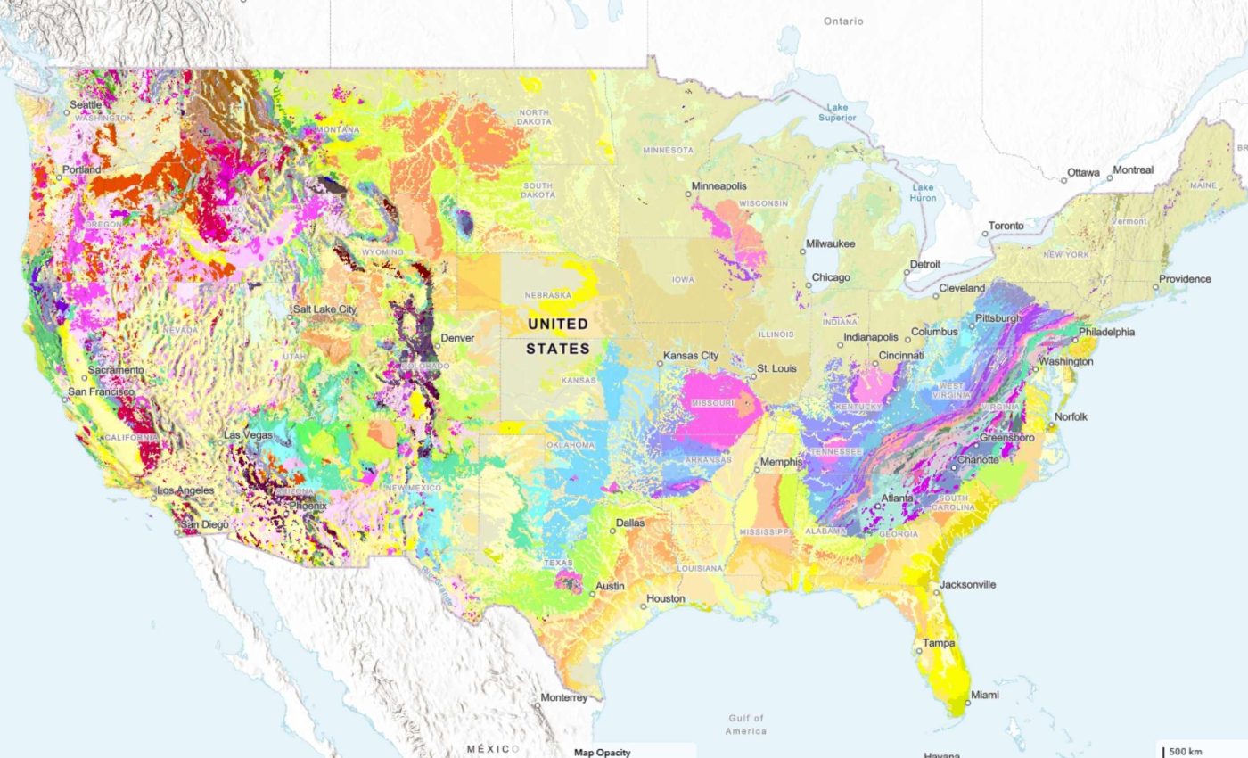
This geologic map shows both the types and ages of rocks and sediments at and below the surface, organized into units with shared traits like composition or age.

These units range from loose sand and gravel to very old bedrock, and together they help explain how landscapes formed and where resources and hazards might be.
What this geological map shows
Joseph Colgan, a research geologist at the USGS, led the team that turned more than a hundred separate maps into one national view. The result ties local details together so patterns make sense at a regional scale.
The map includes the lower 48 states and lets you explore at the surface or look beneath to older layers. Different colors and labels show which materials are present and how they relate in time.
The tool aims to give students, planners, and professionals the same clean starting point, no matter where they work. Consistent layers mean decisions can be based on the same evidence across county or state lines.
Why this map matters
Geologic information is not just for scientists, it supports water planning, infrastructure design, and public safety in real communities.
That is why USGS highlights how updated mapping helps identify hazards and guides mitigation across the Southeast.
“Geologic maps have many uses, such as helping experts look for energy, mineral and water resources,” said Christopher Swezey, USGS National Cooperative Geologic Mapping Program coordinator.
“They can also be used to assess earthquake risks and inform decisions about land use, infrastructure and community planning, and real estate and insurance.”
Those uses stretch from groundwater modeling to where to avoid building on unstable slopes. They also help communities understand long term risks in a clear, evidence based way.
Geological layers revealed by the map
The national map is organized into layers that focus on different slices of geologic time.
One layer shows the geology at Earth’s surface, while others highlight Quaternary deposits, pre Quaternary rocks, and Precambrian rocks.
Each layer answers different questions, such as where young river deposits cover older rock or where ancient crystalline rocks come close to the surface.
The layers help sort out complex histories that cannot be read from a single view.
The online site explains how to switch between layers and filter by age or material, so you can zero in on a question and get a quick, consistent answer.
You can click a location and see the unit name, age, and a short description.
Built fast with smart tools
Past national compilations took decades, but this one came together in about three years. The speed comes from a synthesis approach that standardizes many source maps into a single, queryable database.
“Ongoing mapping efforts continually make new discoveries, but past national maps took decades to create while our new method allows us to update our national map faster than ever possible before,” said Sam Johnstone, a USGS research geologist and lead developer for the mapping project.
The new process means updates can flow in as state and federal surveys add new work.
Standardized units and vocabularies reduce confusion that used to come from different local naming rules. That makes national analysis, from hazards to resources, much more efficient.
How to use the geological map
Classrooms can pull up the map on a phone, tablet, or laptop, search for a unit, and connect to a deeper background with a couple of taps.
Agencies and companies can start with the same base, then layer on their own field data or models.
“This map provides complete, analysis-ready geologic data for the nation, in a format that is easy to expand going forward,” Colgan explained.
“By providing this map online, we aim to enhance educational engagement and foster a greater public appreciation of geology.”
The interface lets you look up the properties of a unit or click a spot to pull the key facts. Those facts also link to more detailed local maps when you need finer scale work.
Value beyond the price tag
A national economic analysis found the monetary value of geological maps ranges from about 7 to more than 10 times the cost of producing them, with some estimates much higher.
That result comes from time saved, better choices, and avoided mistakes across sectors like construction, energy, and real estate.
Those returns grow as maps move from paper to digital, where data can be reused many times without new printing or shipping costs. The more people use a trusted baseline, the more value it creates.
Maps also pay off in safety. Better knowledge of faults, landslides, and soft sediments helps communities target codes and investments where they matter most.
What comes next
Right now the map covers the lower 48 states, with plans to add Alaska, Hawaii, and the U.S. territories. As new fieldwork, lab dates, and interpretations come in, the national view can be refreshed rather than rebuilt from scratch.
If you want to work with the data directly, the National Geologic Map Database catalog lists downloadable packages for each layer and the full geospatial database.
Those files support GIS workflows and connect to geospatial services that can be pulled into common software.
The compilation also points users back to original sources, so specialists can trace details to state surveys or USGS reports. That transparency lets both casual users and experts check the evidence behind the colors.
Click here to view and interact with the new U.S. Geological Survey map…
—–
Like what you read? Subscribe to our newsletter for engaging articles, exclusive content, and the latest updates.
Check us out on EarthSnap, a free app brought to you by Eric Ralls and Earth.com.
—–


